Your playbook for custom gear


TLDR
Problem & Constraints
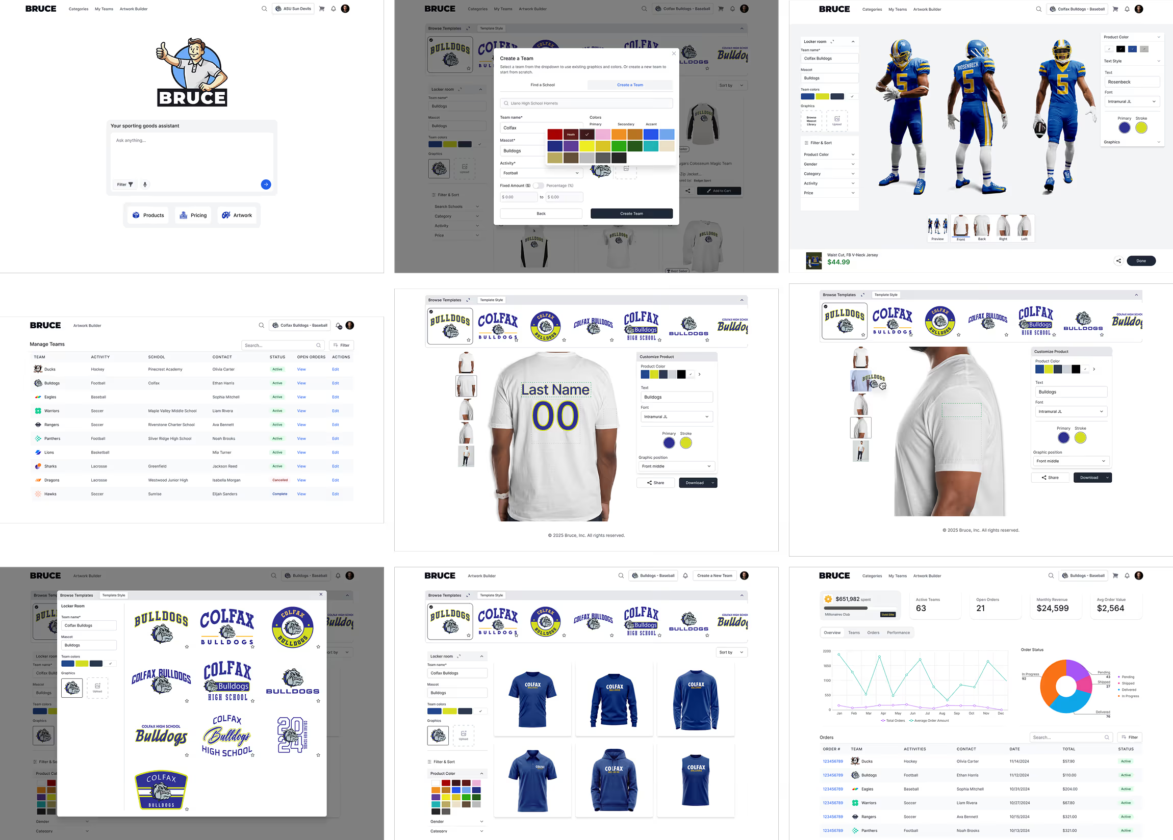
Ordering team apparel traditionally involves messy communication loops between coaches, parents, players, and dealers. Tasks like product selection, artwork application, design approval, and managing sizes or payments often require separate tools. This fragmentation leads to inconsistent branding, delayed deliveries, and frustrated users.
The goal was to design a single digital platform that unified these workflows while remaining intuitive for non-technical users. I faced technical and design constraints, including dynamic artwork rendering across product variants, responsive performance with large data sets, and aligning diverse user roles in a coherent experience. The challenge was balancing flexibility for dealers with accessibility for everyday users.
Process & Key decisions
- Research and definition: Mapped the entire journey for different user roles (coach, dealer, player, parent) to uncover points of friction.
- Information architecture: Created modular flows to support artwork management, ecommerce browsing, and AI-assisted customization in one system.
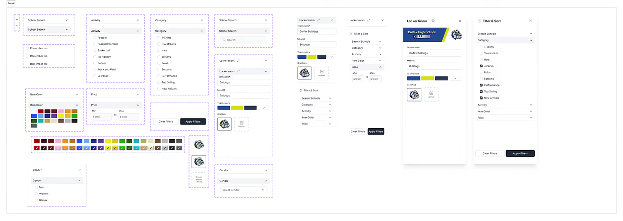
- Design iteration: Used component-based thinking from the start, allowing scalable updates and improved developer handoff.
- AI integration: Defined use cases where Bruce, the assistant, could automate repetitive steps instead of complicating the UI.
Products & Categories
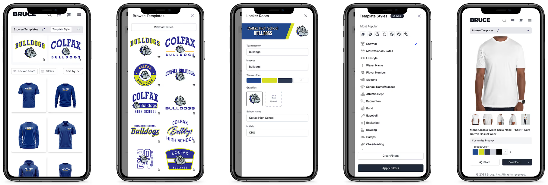
The browsing experience needed to function like a modern ecommerce site while respecting team-level data context.
Features included live artwork previews, dynamic color updates, and sorting/filtering across apparel categories. The interface recognized which team a user belonged to, automatically applying appropriate logos, palettes, and templates.
What was implemented
- Integrated Locker Room and integrated artwork
- Streamlined filters and team-switching actions, cutting browsing complexity by 40%.
- Restructured standard e-commerce designs for clarity and responsiveness, aligning layout hierarchy with user goals.

Products & Category screens
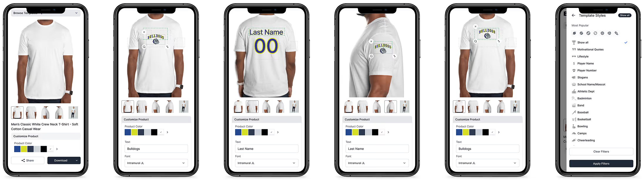
Customize Artwork
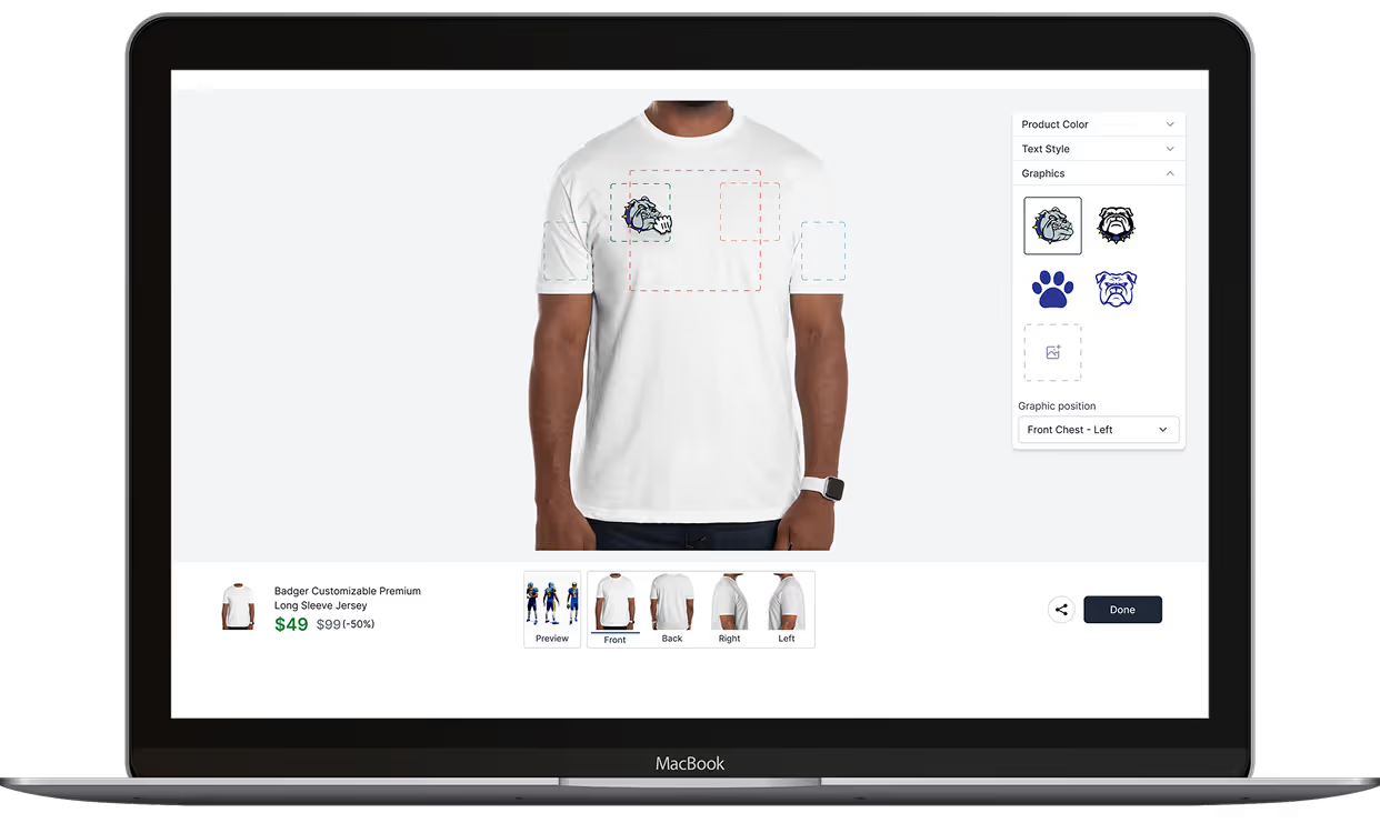
The artwork editor became the defining UX feature for Bruce. It allowed full creative control directly in the browser, letting users change text, colors, and graphics while maintaining brand consistency. Bruce, the AI assistant, automatically positioned player names and numbers, freeing users from manual adjustments. Customizations could instantly sync to checkout, shortening the path from idea to purchase.
What was implemented
- Fully functional on desktop and mobile
- Introduced adaptive panels that optimized space across devices.
- Improved feedback responsiveness using real-time preview rendering.
Customize Artwork screens
Locker Room
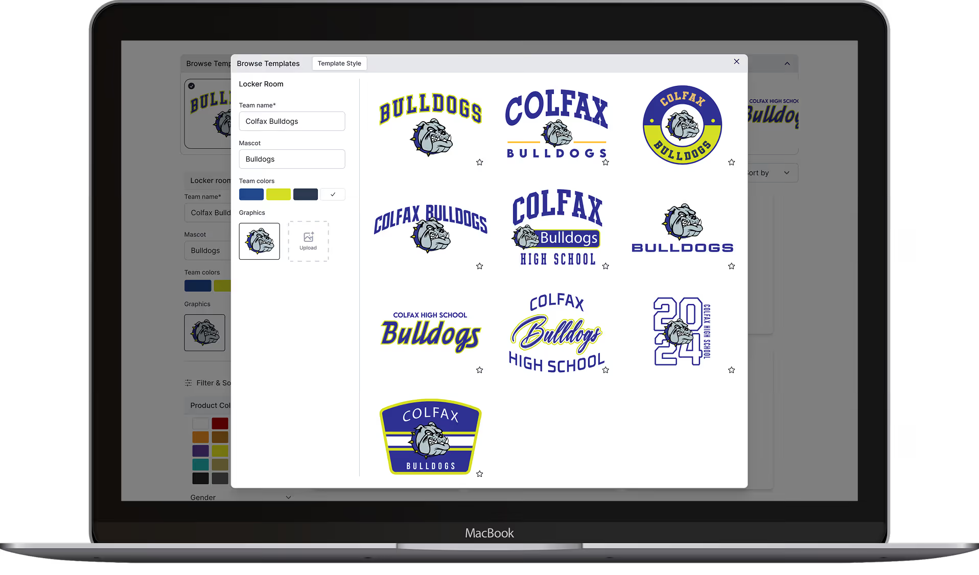
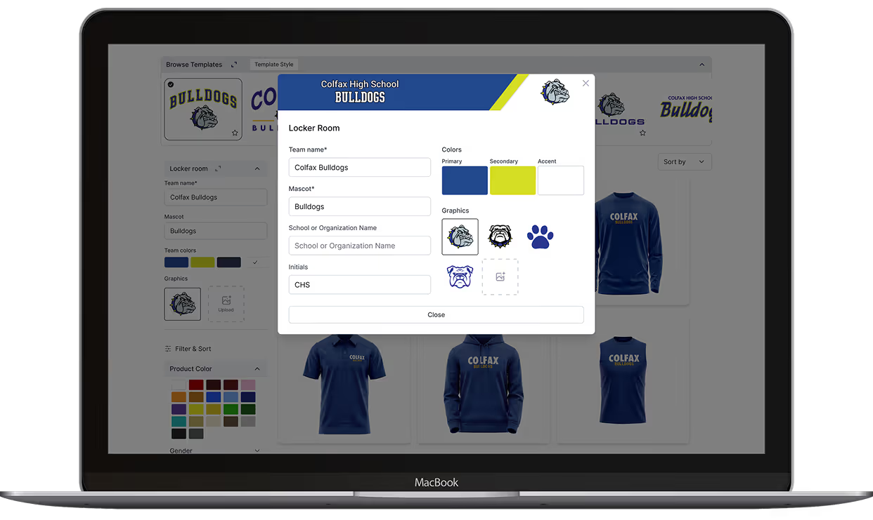
The Locker Room was designed to give a personalized hub for each team that blended identity management with creative control.
It stored branding elements, including team info, colors, mascots, and artwork files, and connected directly to the ecommerce flow. Users could import templates or upload new graphics, creating a seamless creative loop.
What was implemented
- Unified disparate design management into one accessible dashboard.
- Added batch artwork switching to support dealers handling multiple teams.
- Enhanced visual hierarchy for art assets, simplifying bulk operations.
Design System & Components
Final Experience