Marketing music campaign for Rain Retail Software


The Problem
Music shop owners are running two businesses at once. Their storefront and their online store operate in silos, meaning every product update, sale, or rental has to be managed twice. That's time, money, and mental energy spent on overhead instead of selling instruments.
Rain Retail needed a campaign that could walk into NAMM and make that problem feel solved before a vendor ever signed up.
Process & Key decisions
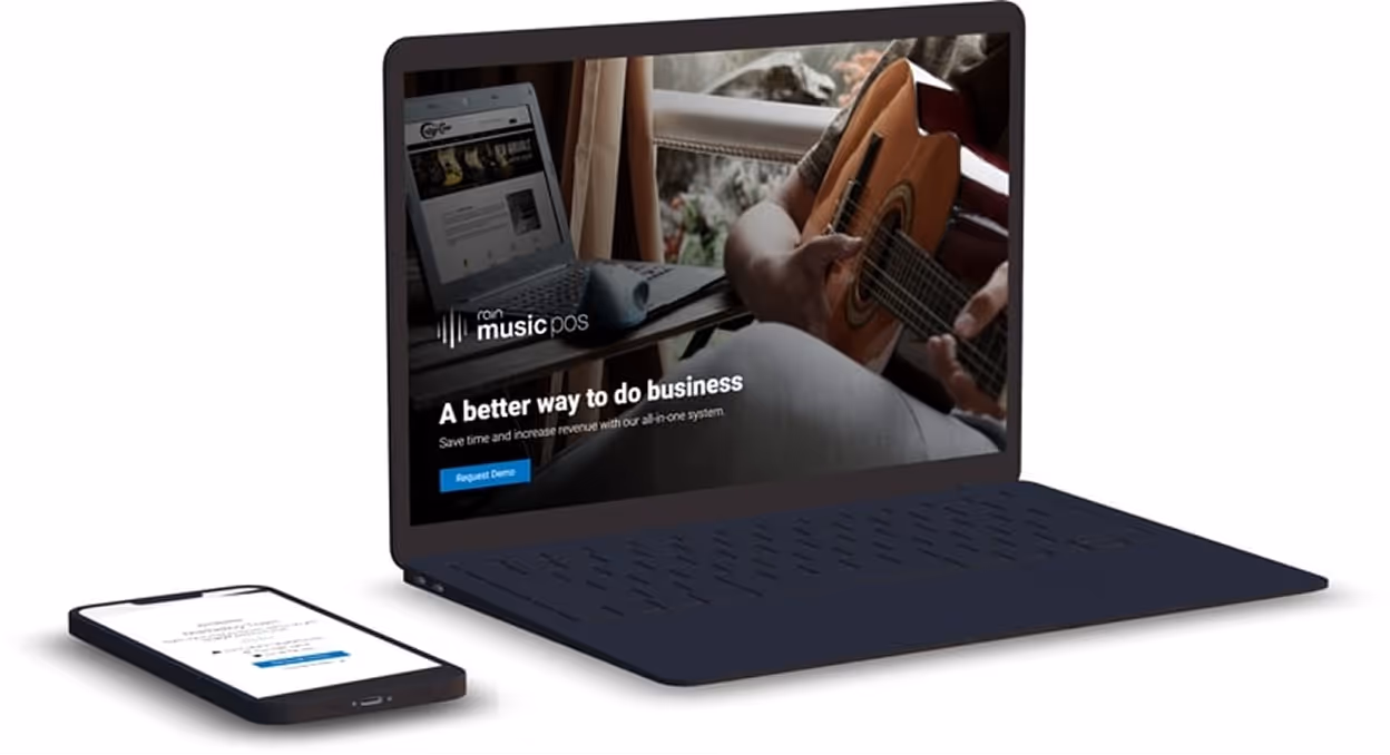
Microsite
Built from scratch to do one job: convert. The layout and visual direction came from me, structured around the pain points we heard during on-site visits with real shop owners.
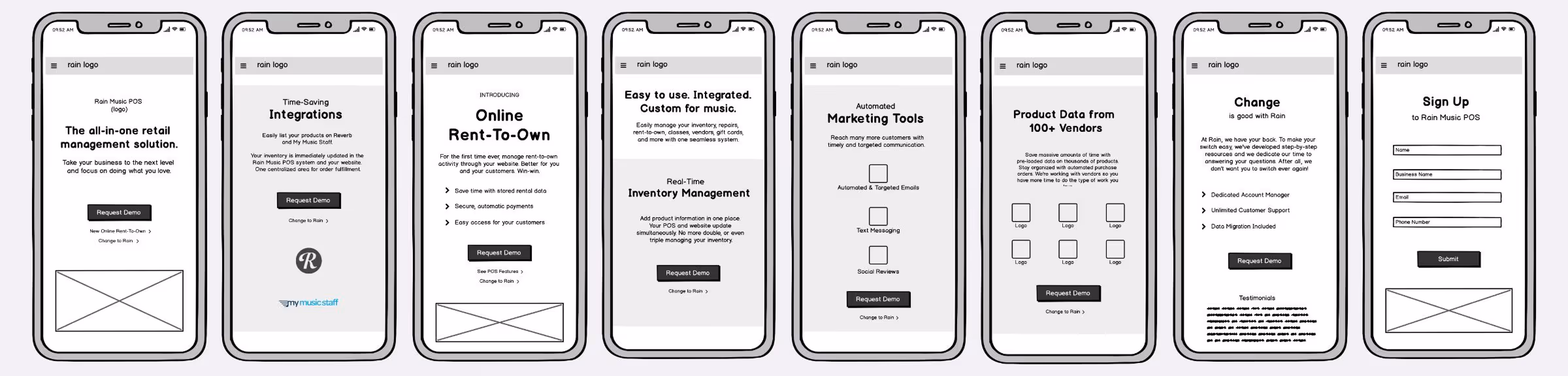
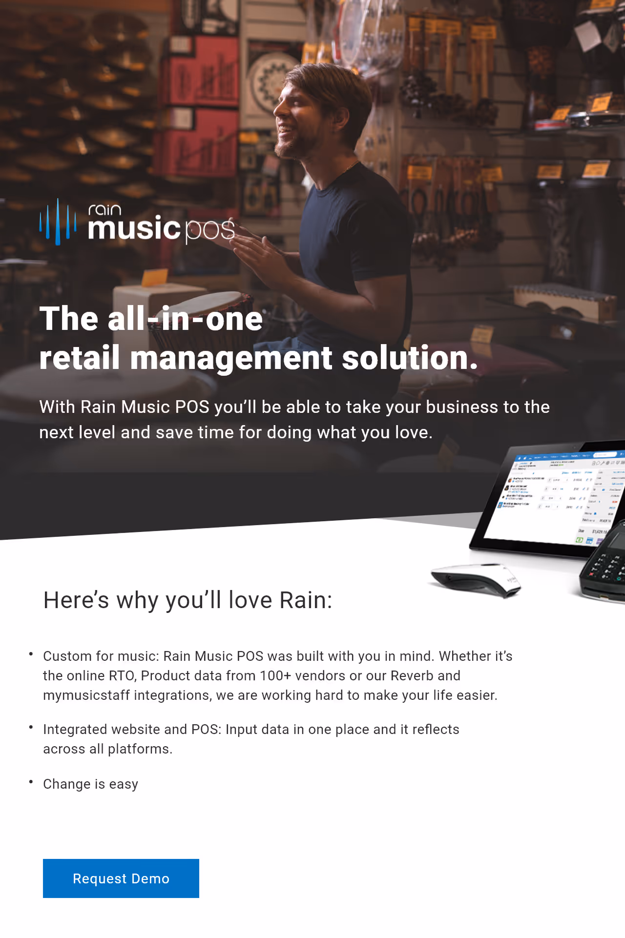
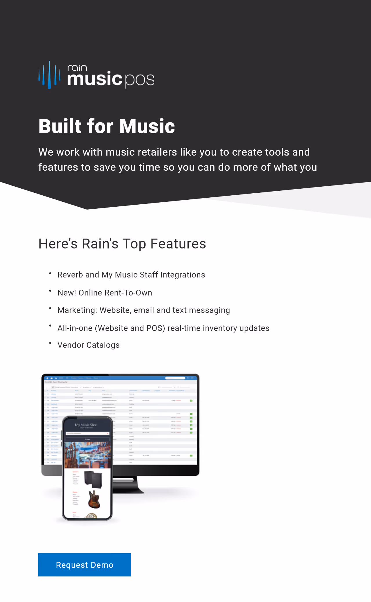
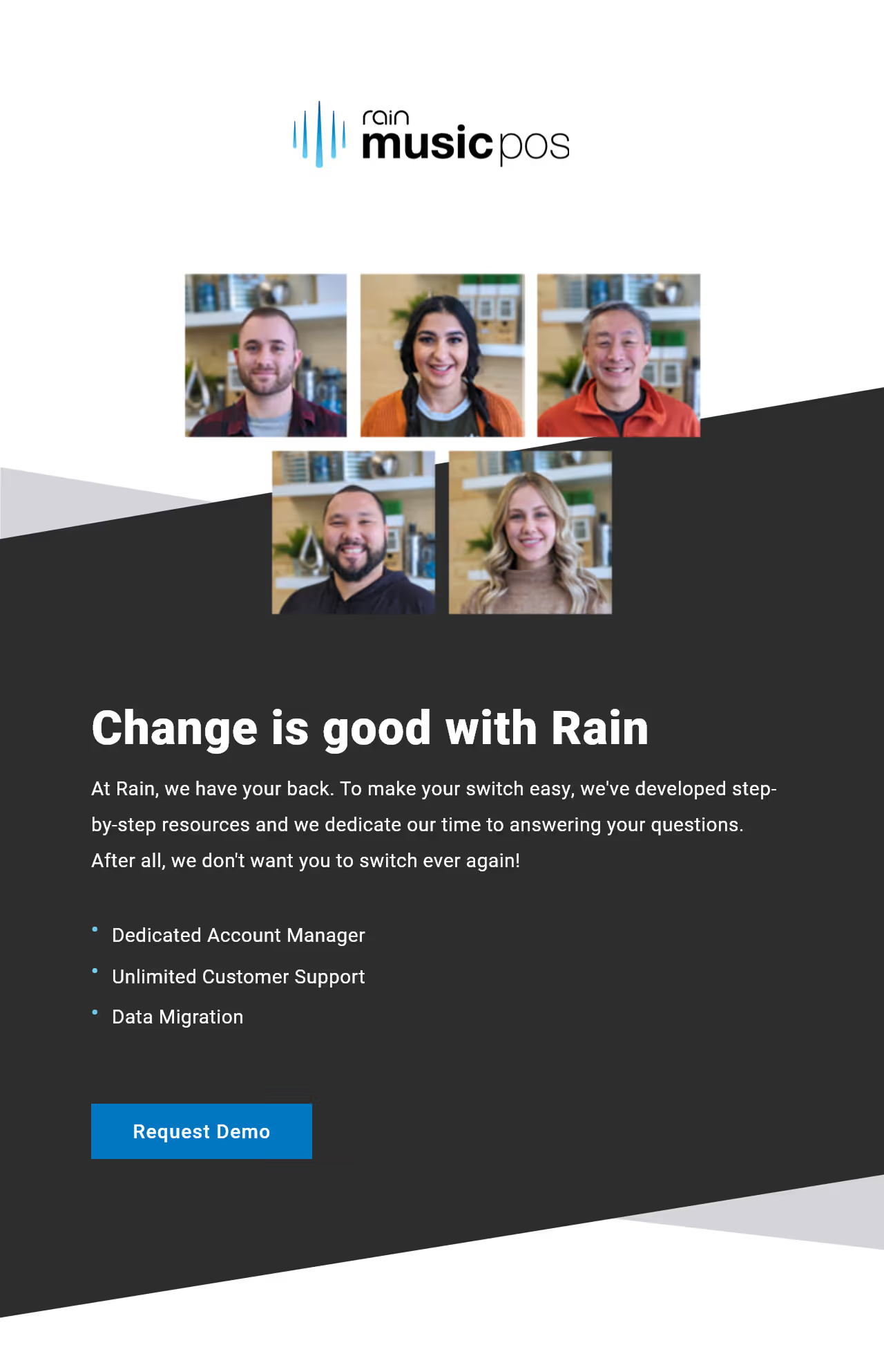
Email Campaign
A three-part MailChimp series, each focused on a single value prop. Integrations. Online Rent-to-Own. Switching is Easy. I designed and developed all three. Spacing them out gave each message room to land instead of competing with itself.
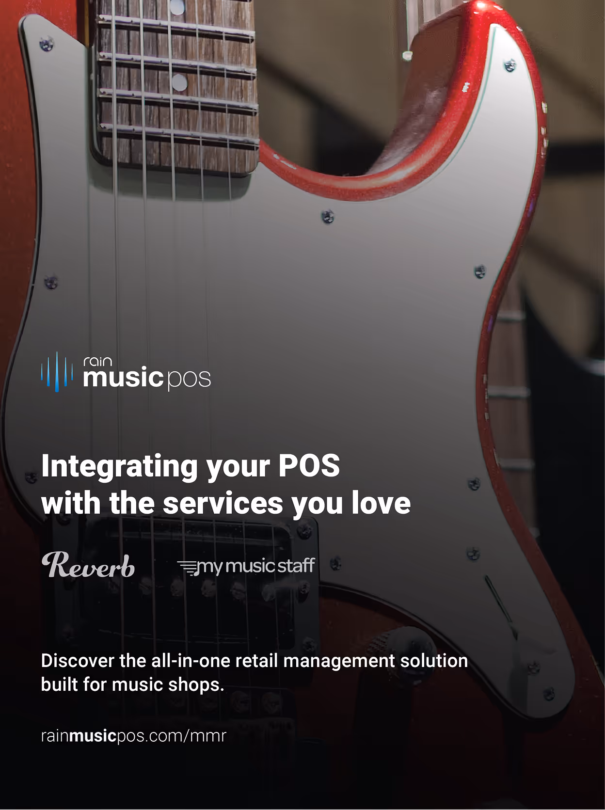
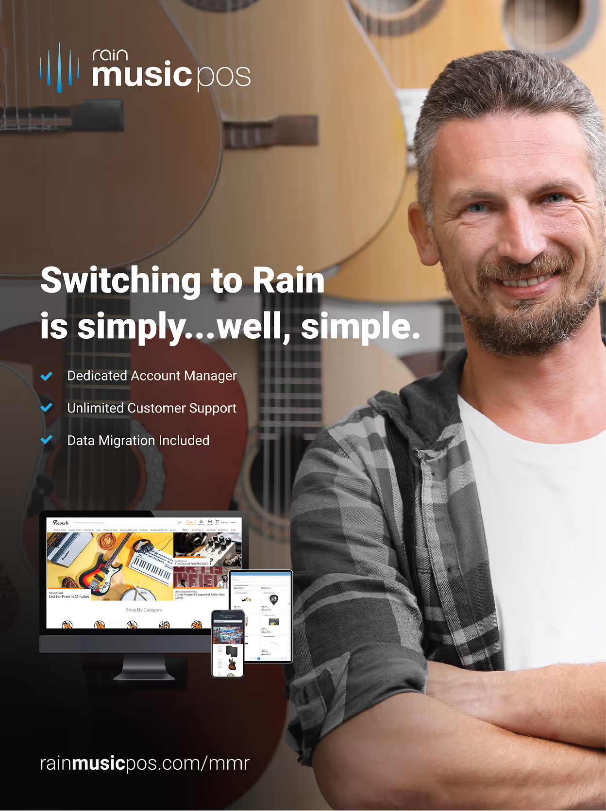
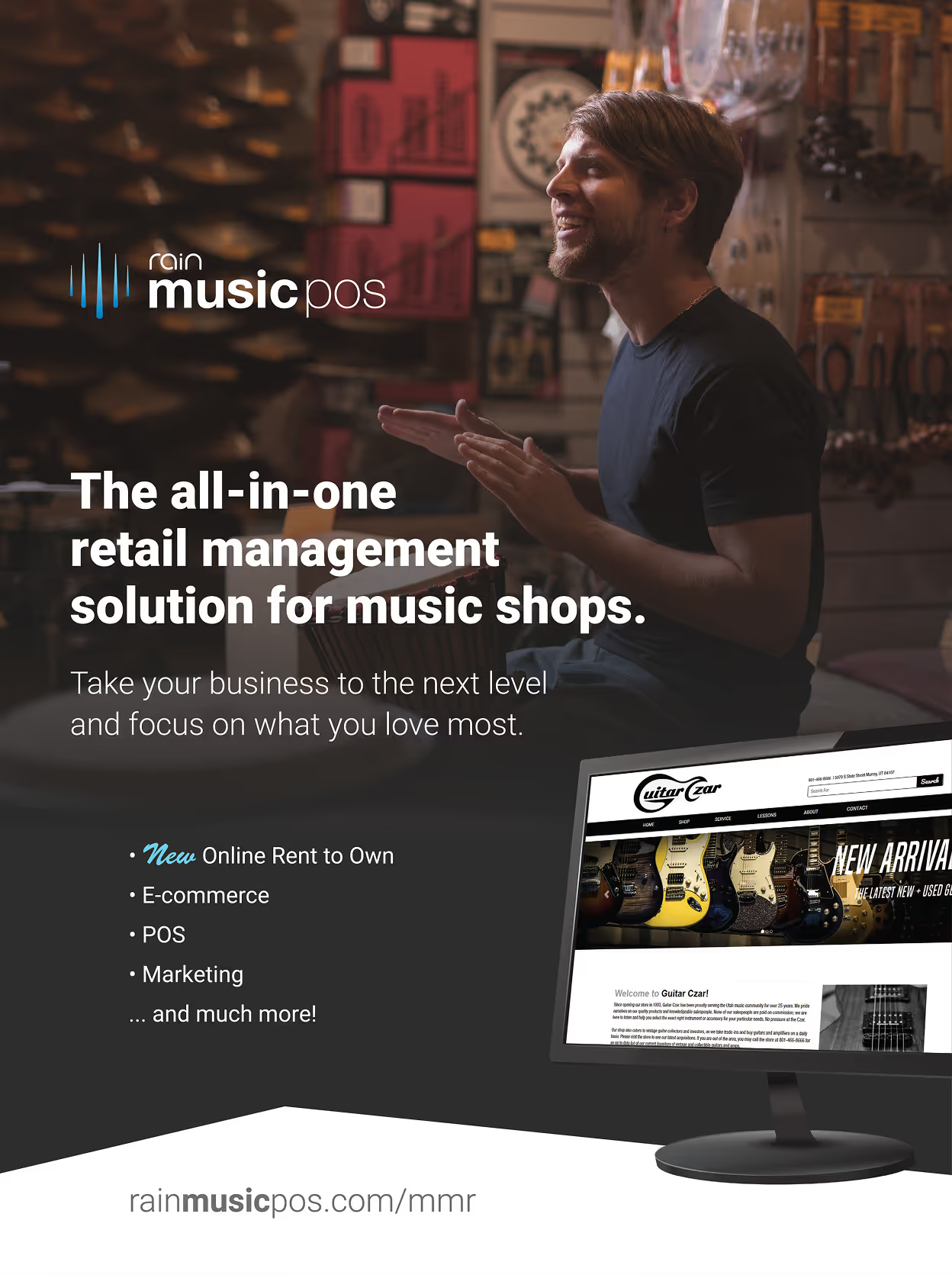

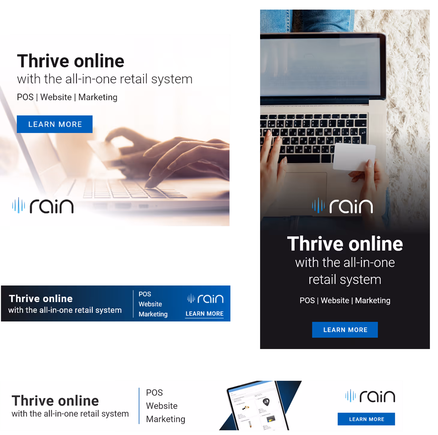
Magazine Ads
A three-month run in MMR and Music and Sound Retailer, intentionally timed to overlap with the email campaign. I designed the ads to mirror the email series visually so that both channels reinforced each other.
Design System & Components
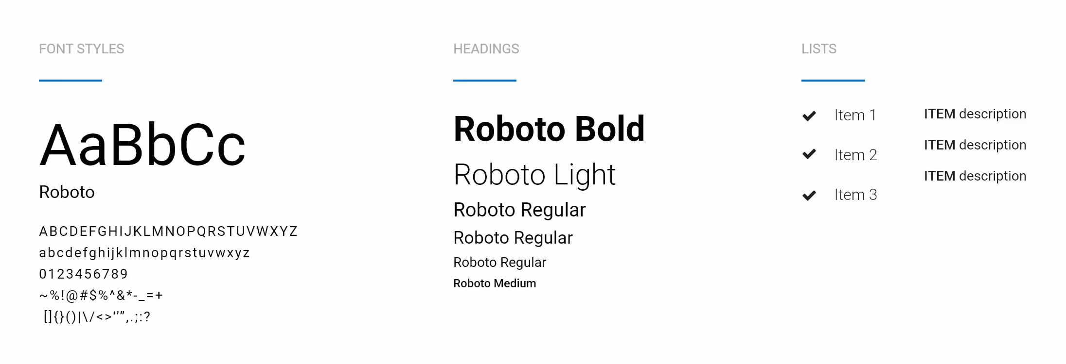
The style I set at the start held through every channel without needing to be renegotiated.

Final Experience

